CheckMate
OVERVIEW
Couples struggle with organizing, delegating, and managing tasks together when there isn’t an obvious owner to take the lead. CheckMate helps organize and simplify this process – it’s a task management app that helps couples regain control of their lives.
In 2018, I took a General Assembly online course in UX to help pivot my career from industrial design and innovation consulting into digital product design. CheckMate is a conceptual product from that class.
MY ROLE
Lead Product Designer
UX/UI Design
User Research
Synthesis & Analysis
Research & Strategy
I conducted interviews with 3 couples to gain understanding and insight into how they successfully (or unsuccessfully) managed their lives together. I focused on couples who were going through recent life changes (ex: new baby) predicting that time & task management were a fresh challenge in their lives. I also conducted a competitor analysis, feature audit & prioritization, and created a primary persona to help dial in the primary features and user flow of the app.
Affinity Mapping - Take Aways
People are adopting to digital tools, but want a balance (not replacement) with an analog world
For some management tasks, there are distinct roles and an obvious owner
When there isn’t an obvious owner, tasks are left undone or mismanaged
Delegation can feel awkward in a relationship
Competitive Analysis - Take Aways
Task Management Competitors: Google Tasks, Todoist, Evernote, Wunderlist, Thing 3
Most task management apps are cloud based and vary from free to premium
While group task management apps exist, they currently cater to the professional project management vs. personal management
No one app is targeting couples/ friends/family
User Testing
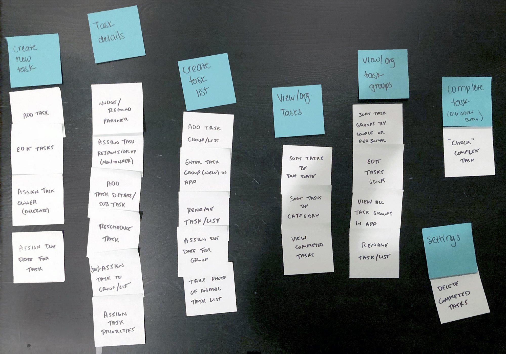
Thought the project, I conducted card sorting and early stage paper prototyping on initial screen flows to dial in the key features and navigation. Towards the end of the project, I conducted Usability Testing on the high fidelity wireframes.
Competitive Analysis - Take Aways
From the Feature Card Sort, I learned how quickly this could get complicated. I decided to focus on creating/managing tasks and highlight the owner & informed for the primary flow (shown below).
Usability Testing - Take Aways
Adjust the visual hierarchy to differentiate between tasks and their details
Include ability to give positive rewards to your partner (kudos)
Include an ability to attach website links easily - especially for creating gift lists together
Final Wireframes & Design
As this was my first attempt in app design, I decided to familiarize myself in both Android and iOS pattern libraries, so I designed the app with the look & feel of Material Design but for an iOS device (mainly because I have an iPhone 8 to test the wireframes). The final wireframes focus on primary flows including adding a new list, adding new tasks, managing task owners, and nudging or giving kudos to your partner.
This was the result of 6 week UX Circuit (online) Course through General Assembly. I completed all the work on this project and checked-in remotely with a mentor weekly throughout the project.


